
EN 16186-3: Europe’s Standard for Safer Driver Displays
EN 16186-3 defines critical standards for railway driver cab displays, enhancing safety, efficiency, and reducing human error with human-centred, clear information design.
Understanding EN 16186-3: A Guide to Driver’s Cab Display Design
EN 16186-3 is a European Standard that specifies the principles and requirements for the design and arrangement of displays within a railway vehicle’s driver’s cab. This standard is a critical component of the broader EN 16186 series, which focuses on creating an ergonomic, safe, and efficient working environment for train drivers. Its primary goal is to ensure that information is presented to the driver in a clear, unambiguous, and timely manner, thereby reducing cognitive load and minimizing the potential for human error.
Core Principles of Display Design under EN 16186-3
The standard is built upon fundamental human factors and ergonomic principles to ensure that display systems support the driver’s tasks rather than complicate them. These core principles guide every aspect of the display’s technical implementation.
Human-Centred Design
At its heart, EN 16186-3 champions a human-centred design approach. This means the system is designed around the needs, capabilities, and limitations of the driver. It requires designers to consider tasks such as monitoring speed, responding to system alerts (e.g., from ETCS or national train control systems), and operating doors. The display must provide the right information at the right time, in the most intuitive format possible.
Information Hierarchy and Prioritization
Not all information is of equal importance. The standard mandates a clear hierarchy for presented data. This involves:
- Critical Information: Data requiring immediate driver awareness or action (e.g., overspeed warnings, emergency brake application, critical system failures) must be the most salient.
- Advisory Information: Data related to upcoming operational changes or non-critical system status (e.g., upcoming speed restrictions, system status normal).
- Status Information: General background information that the driver may need to reference but does not require constant attention (e.g., HVAC status, passenger information system status).
Consistency and Interoperability
To reduce learning curves and ensure safe operation across different rolling stock, consistency is key. EN 16186-3 promotes the use of standardized symbols, colour codes, and layouts. This is particularly vital for interoperability, where drivers may operate various types of trains on different lines or even across national borders. A consistent Human-Machine Interface (HMI) ensures that a driver’s response to a specific symbol or alert is instinctual and correct, regardless of the specific vehicle they are operating.
Key Technical Specifications and Requirements
EN 16186-3 moves from principles to specific, measurable technical requirements that manufacturers must adhere to. These specifications cover the physical and logical aspects of the display.
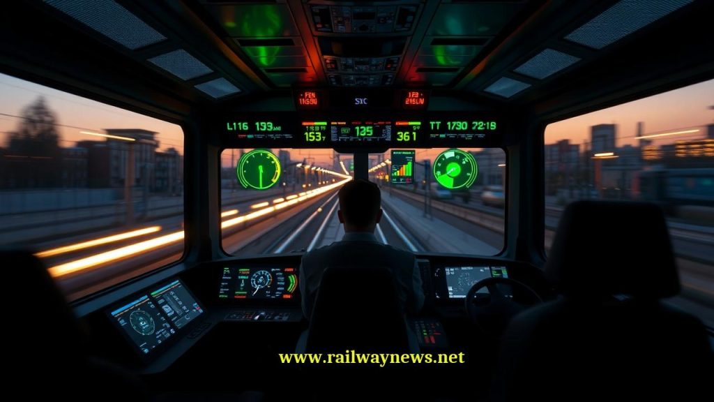
Visual Characteristics
- Luminance and Contrast: Displays must be readable under all anticipated ambient lighting conditions, from direct bright sunlight to complete darkness inside a tunnel. This requires automatic or easily adjustable brightness and a minimum contrast ratio between text/symbols and their background.
- Colour Coding: The standard defines a specific palette and meaning for colours to ensure immediate recognition. This is crucial for safety-critical information. For example:
- Red: Danger or a condition requiring immediate action.
- Yellow/Amber: Caution, a developing fault, or information requiring awareness.
- Green: Normal or safe operating conditions.
- Blue/Cyan: Mandatory instructions or conditions (e.g., a specific operating mode is active).
- White: Neutral status information or values.
- Legibility and Readability: This covers the design of characters and symbols. The standard specifies requirements for font size, character height, and spacing to ensure that all text is easily legible from the driver’s normal seated position, even under vibration. Sans-serif fonts are generally preferred for their clarity on digital screens.
Information Arrangement and Layout
- Zoning: The display area should be logically zoned. Information related to the primary driving task (e.g., current speed, target speed, braking information) must be located in the driver’s primary field of view. Ancillary information should be placed in peripheral areas.
- Grouping: Functionally related information should be visually grouped together. For instance, all data related to the train’s traction system should be presented in a single, clearly demarcated area of the screen.
- Minimizing Clutter: The principle of “dark on quiescent” is often applied. This means the display should remain relatively dark or uncluttered during normal operation, with new information or alerts only appearing when necessary to draw the driver’s attention effectively.
Symbols and Alarms
- Pictograms: The standard encourages the use of standardized, easily recognizable pictograms (symbols) as defined in other related standards (like UIC 612). This reduces reliance on text and overcomes language barriers.
- Audible and Visual Alerts: Alarms must be multi-modal. A critical alert should be accompanied by both a visual cue (e.g., a flashing red symbol) and an audible sound. The characteristics of the sound (tone, frequency) can also be used to indicate the level of urgency.
Comparison of Compliant vs. Non-Compliant Design
The following table illustrates the practical difference between a display designed in accordance with EN 16186-3 and one that fails to meet its requirements.
| Design Aspect | EN 16186-3 Compliant Approach (Good Practice) | Non-Compliant Approach (Poor Practice) |
|---|---|---|
| Colour Usage | Uses a standardized, limited colour palette (e.g., red for immediate action, yellow for caution) to convey information instantly. | Uses inconsistent or arbitrary colours. Overuses colours, leading to confusion about the priority of information. |
| Information Density | Presents only relevant information for the current task. Follows a “dark on quiescent” principle to avoid distracting the driver. | Overloads the screen with excessive data, making it difficult for the driver to identify critical information quickly. |
| Alarms & Alerts | Alerts are prioritized and use a combination of visual (flashing symbol) and audible cues. The driver is clearly guided on the required action. | Multiple non-critical alarms sound simultaneously, creating an “alarm cascade” that overwhelms the driver and masks important warnings. |
| Layout & Zoning | Speed and signalling information are placed centrally in the primary field of view. Related data is logically grouped. | Critical information is placed in a peripheral area, forcing the driver to look away from the track. Layout is illogical and cluttered. |
| Text & Symbols | Uses clear, legible sans-serif fonts of an appropriate size. Employs standardized, internationally recognized symbols. | Uses small, stylized fonts that are difficult to read under vibration. Symbols are ambiguous or non-standard, requiring interpretation. |
The Role in Safety and Certification
Compliance with EN 16186-3 is not merely a design preference; it is a fundamental aspect of the safety case for new or refurbished rolling stock. National Safety Authorities (NSAs) and Notified Bodies (NoBos) will assess the driver’s cab HMI against the requirements of this standard as part of the process for granting an Authorization to Place in Service (APIS). A well-designed display system that adheres to EN 16186-3 is a direct contributor to operational safety, demonstrating that risks associated with human-machine interaction have been properly mitigated.
Frequently Asked Questions about EN 16186-3

Railway infrastructure, rolling stock and transport technologies specialist focused on global rail industry developments, high-speed rail systems, signaling technologies and freight transportation. Covering railway investments, public transport modernization, rail operations and international mobility projects across Europe, Asia and North America.